Your YouTube thumbnail is a 1.2-second sales pitch. That's the average time a viewer spends deciding whether to click your video or keep scrolling. With over 500 hours of video uploaded every minute, your thumbnail isn't just an image. It's the single most important factor determining whether anyone watches your content.
Top creators like MrBeast invest up to $10,000 per thumbnail through extensive testing. Why? Because a 2% improvement in click-through rate (CTR) can translate to millions of additional views through YouTube's algorithmic amplification.
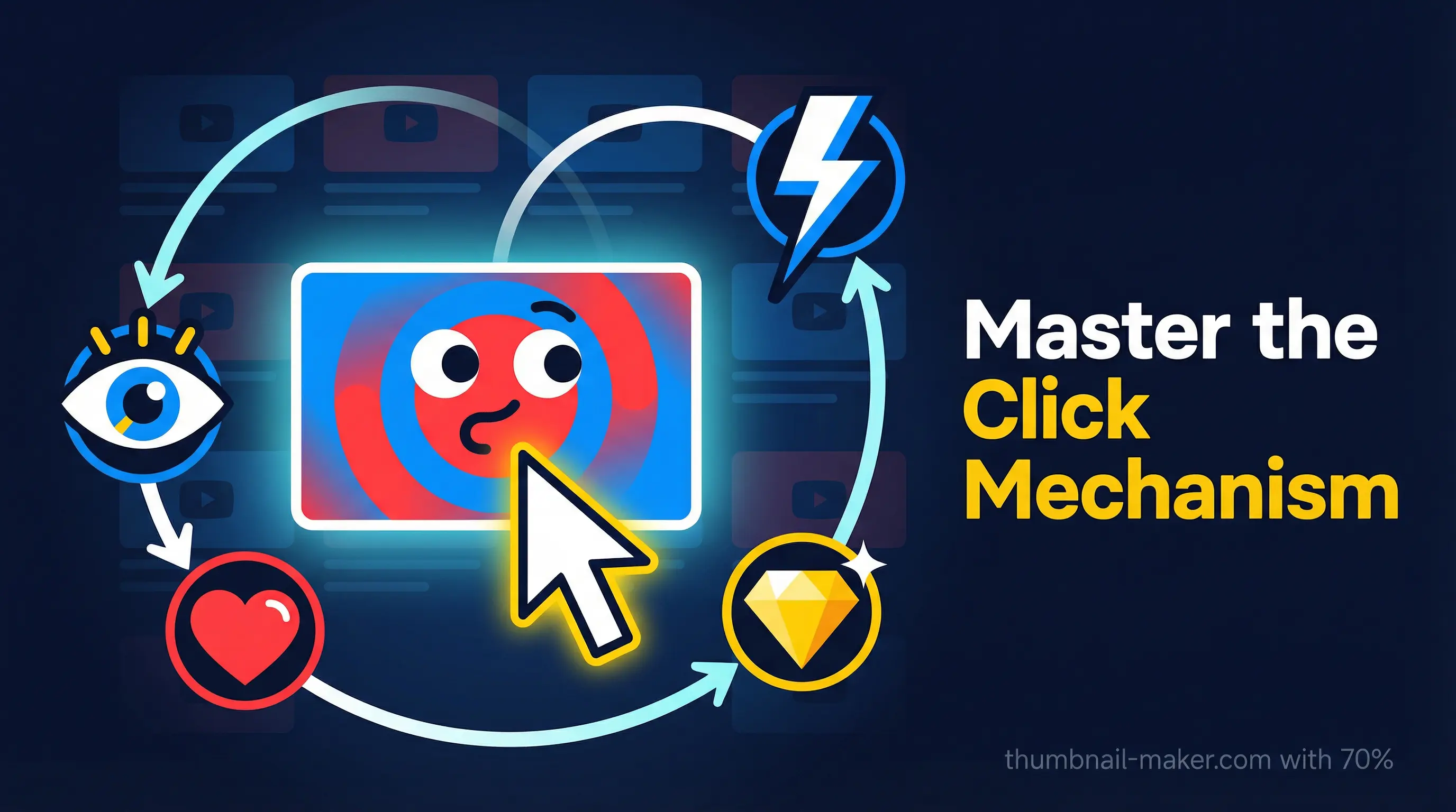
In this guide, we'll break down the click mechanism, the psychology and design principles that make viewers physically unable to resist clicking, and give you actionable YouTube thumbnail design tips you can apply today.
What Is the Click Mechanism?
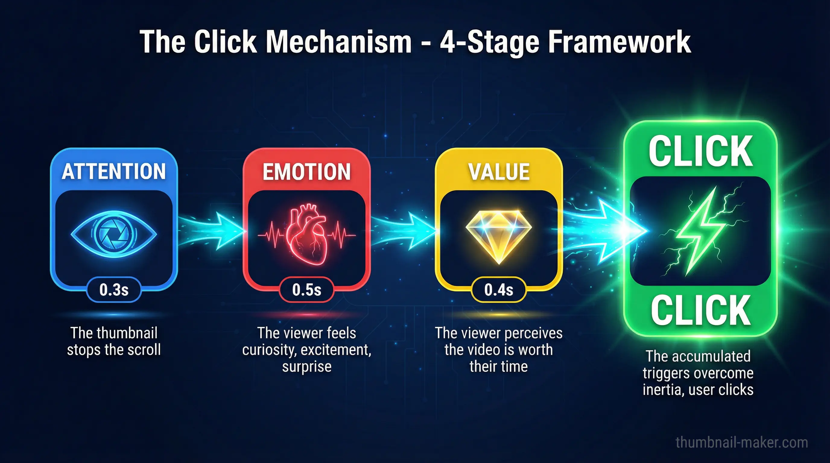
The click mechanism isn't a single trick. It's the combined system of psychological triggers embedded in your thumbnail that converts a passive scroller into an active clicker. Think of it as a chain reaction:
- Attention capture: Your thumbnail stops the scroll (0.3 seconds)
- Emotional hook: The viewer feels something: curiosity, excitement, surprise (0.5 seconds)
- Value signal: The viewer perceives the video is worth their time (0.4 seconds)
- Click impulse: The accumulated triggers overcome the viewer's inertia
Every design decision in your thumbnail should serve one of these four stages. Let's explore how to optimize each one.
Stage 1: Attention Capture. Stop the Scroll
Use High-Contrast Color Combinations
The human brain processes images 60,000 times faster than text. Color contrast is your first weapon for attention capture.
The most effective high-contrast combinations include:
- Red and blue: creates visual tension that's almost impossible to ignore
- Yellow and purple: the highest contrast pairing on the color wheel
- Orange and teal: cinematic and eye-catching
Avoid colors that blend with YouTube's interface. Whites, reds, and blacks tend to merge into the platform's background. Instead, use orange, green, yellow, and bright blue to create visual separation.
Pro tip: Limit your palette to 2–3 colors. One dominant color, one contrasting accent, and optionally one text color. More than that creates visual chaos.
Make Faces the Focal Point
Human faces are natural attention magnets because our brains have specialized neural pathways dedicated exclusively to facial recognition. The data backs this up:
- Videos featuring human faces receive 921,000 more views on average compared to faceless thumbnails
- Close-up faces making direct eye contact trigger stronger emotional reactions
- The top of the head should be near the top edge of the thumbnail to maximize facial detail
Don't position your subject far from the camera. At mobile size (168×94 pixels), distant faces lose all emotional impact.
Follow the Simplicity Principle
Thumbnails with more than three major visual elements create cognitive overload that pushes viewers past the 0.3-second attention window.
The winning formula: one clear subject + one emotion + one short text line.
Remove anything that doesn't directly contribute to the click mechanism: background clutter, decorative elements, and unnecessary graphics are attention diluters, not attention grabbers.
Stage 2: Emotional Hook. Make Them Feel Something
Master the Curiosity Gap
The curiosity gap is the single most powerful click driver in thumbnail design. It works by giving viewers enough information to spark curiosity while deliberately withholding details that can only be discovered by watching.
Effective curiosity gap techniques:
- Blur or censor specific elements in the image
- Show partial information: a dramatic before without the after
- Use visual contradictions: things that shouldn't be together
- Create visual questions: compositions that demand an answer
The key difference between a curiosity gap and clickbait: a curiosity gap accurately represents your content while maintaining suspense. Clickbait misleads, and YouTube's algorithm punishes misleading thumbnails by reducing recommendation traffic by over 80% within weeks.
Leverage Emotional Expression
Not all emotions are created equal in thumbnail design. Here's what the data shows:
| Expression | % of Thumbnails | Avg. Views |
|---|---|---|
| Happy | 25.3% | ~1.5M |
| Neutral | ~40% | ~800K |
| Sad | 1.8% | ~2.3M |
| Surprised/Shocked | ~15% | ~1.8M |
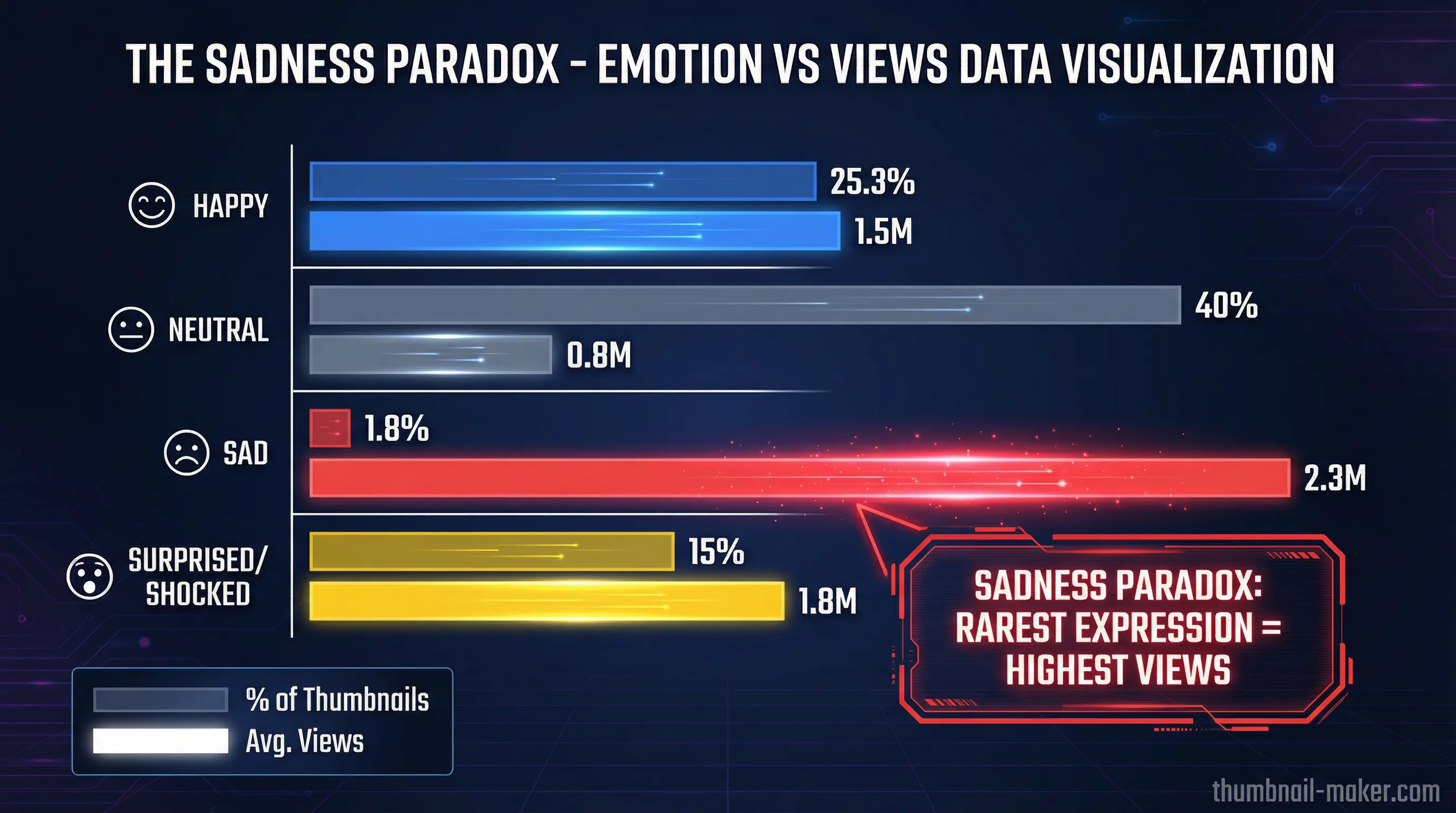
The "sadness paradox" is real: sad expressions are the rarest but generate the highest views. Emotional intensity and authenticity matter more than universal positivity.
The 2026 trend is moving away from the extreme "YouTube face" toward authentic, genuine reactions. Audiences have developed skepticism toward cartoonishly exaggerated expressions. Subtle but genuine emotion now outperforms theatrical overreaction.
Trigger FOMO (Fear of Missing Out)
FOMO-based triggers in thumbnails generate measurable CTR improvements:
- Urgency language ("Before it's gone") → +41% CTR
- Social proof ("Everyone is talking about...") → +36% CTR
- Exclusivity ("First look", "Never seen before") → +33% CTR
But use these sparingly and honestly. Channels that consistently employ false urgency experience a 28% decline in CTR over six months as viewers develop trust fatigue.
Stage 3: Value Signal. Promise Something Worth Clicking
Text That Sells Without Overwhelming
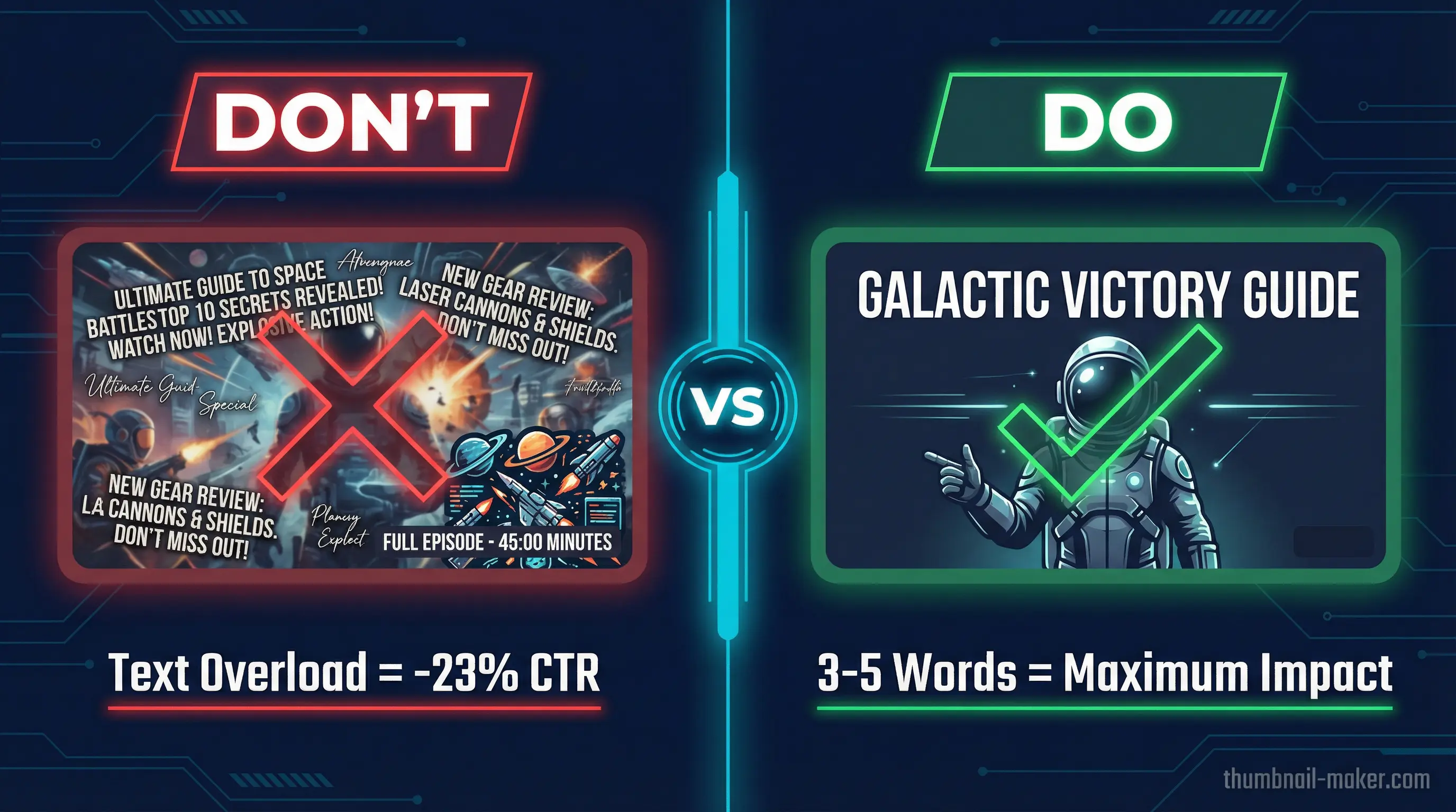
The data is clear: thumbnails with fewer than 12 characters significantly outperform text-heavy designs. Viewers process only 2–3 words when glancing at a thumbnail in a fast-scrolling feed.
Text best practices:
- 3–5 words maximum: enough to add context, not enough to overwhelm
- Bold, sans-serif fonts: Bebas, Impact, Montserrat, and Oswald maintain clarity at mobile sizes
- High contrast with background: yellow on black, white on dark, dark on light
- Never repeat the title: use text to complement what the title already says
Avoid the bottom-right corner (duration timestamp overlay) and the left edge (interface icons). The top-center and center are your safest text zones.
Show the Transformation or Outcome
Viewers click when they perceive clear value. Show them what they'll gain:
- Before/after compositions for tutorial content
- The end result for project or build videos
- The key insight visualized for educational content
- The dramatic moment for entertainment content
This isn't about spoiling the video. It's about giving viewers a reason to believe their time will be well spent.
Stage 4: Click Impulse. Remove All Friction
Optimize for Mobile First
Over 70% of YouTube viewing happens on mobile devices. If your thumbnail doesn't work at 168×94 pixels, it doesn't work.
Mobile optimization checklist:
- Text is readable at thumbnail size without zooming
- Facial expressions are clearly visible
- The main subject fills at least 60% of the frame
- No critical elements in YouTube's overlay zones
- Colors remain vibrant and distinct at reduced size
Maintain Brand Consistency
Develop a recognizable thumbnail style across your channel. Consistent fonts, colors, and layout patterns build brand recognition. Viewers can spot your content instantly in a crowded feed, reducing the cognitive effort needed to decide to click.
This doesn't mean every thumbnail looks identical. It means your thumbnails share a visual DNA that makes your channel recognizable at a glance.
How to Make a Good YouTube Thumbnail: Step-by-Step
Here's a practical workflow for creating thumbnails that leverage the full click mechanism:
Step 1: Set Up Your Canvas
| Spec | Requirement |
|---|---|
| Dimensions | 1280 × 720 pixels (minimum) |
| Ideal Resolution | 1920 × 1080 pixels |
| Aspect Ratio | 16:9 |
| File Format | JPG or PNG |
| Max File Size | 2 MB |
Step 2: Capture the Right Source Image
Shoot potential thumbnail images during filming, not after. You want:
- Clear focus with no motion blur
- A genuine emotional expression (not posed)
- Good lighting on the face
- A clean or controllable background
Many top creators take 50+ potential thumbnail photos during a single shoot.
Step 3: Build the Composition
- Place your subject using the rule of thirds. Off-center creates dynamic tension
- Apply background treatment: simplify, blur, or replace to eliminate distractions
- Establish color contrast: ensure the subject pops against the background
- Add text sparingly: 3–5 words maximum, positioned in a safe zone
- Include directional cues if needed: arrows or circles to guide attention
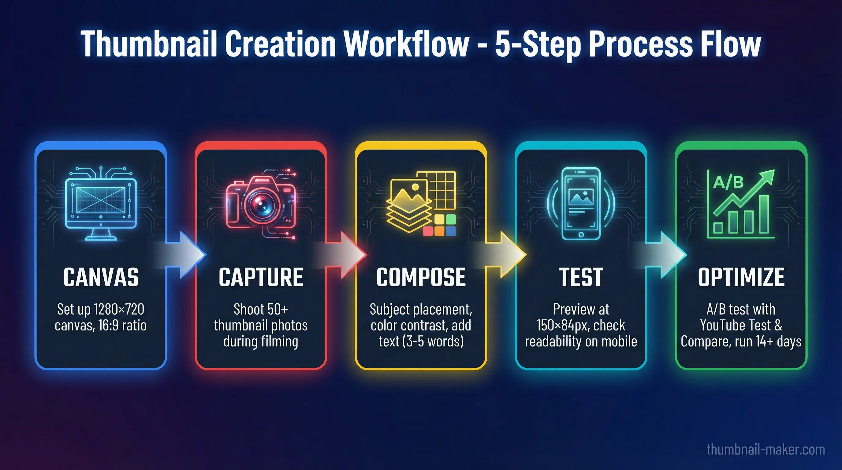
Step 4: Test at Mobile Size
Before finalizing, shrink your design to 150×84 pixels. Ask yourself:
- Can I read the text?
- Can I identify the facial expression?
- Does it stand out against a white background (light mode) and dark gray background (dark mode)?
- Does it make me curious?
If the answer to any of these is no, simplify further.
Step 5: A/B Test Your Thumbnails
YouTube's native Test & Compare feature lets you upload up to 3 thumbnail variations. YouTube shows each to different audience segments and reports the winner based on watch time share.
For reliable results:
- Run tests for at least 14 days
- Ensure each variation gets 500+ impressions minimum
- Compare CTR alongside retention metrics. High CTR with low retention means your thumbnail overpromises
Even testing 2–3 variations can reveal which elements resonate with your audience.
Make Thumbnails Faster with AI
Designing effective thumbnails is both an art and a science, and it can be time-consuming. That's where AI-powered tools come in.
ThumbnailMaker helps you create professional, click-optimized thumbnails in seconds:
- AI-generated designs that follow proven click mechanism principles
- Smart text placement that avoids YouTube's overlay zones automatically
- Color optimization for maximum contrast and attention capture
- One-click variations for easy A/B testing
- Mobile preview to ensure your thumbnail works at every size
Instead of spending hours in Photoshop perfecting every thumbnail, you can generate multiple high-quality options, pick the best one, and get back to creating content.
Common Thumbnail Mistakes That Kill Your CTR
Avoid these pitfalls that sabotage even good content:
1. Text Overload
Thumbnails with excessive text see a 23% drop in CTR compared to clean designs. If you need more than 5 words, your thumbnail is doing the title's job.
2. Low Contrast
Colors that look great on your editing monitor may become invisible on a phone screen. Always test in both light and dark mode at mobile size.
3. Misleading Imagery
High CTR with low retention is worse than low CTR. YouTube's algorithm actively demotes videos where viewers click away quickly. Your thumbnail must honestly represent the video.
4. Ignoring Safe Zones
The bottom-right corner is always covered by the duration timestamp. The left edge gets covered by interface icons. Critical elements placed there are invisible to viewers.
5. No Emotional Connection
A thumbnail without a face, emotion, or curiosity trigger is just a screenshot. And screenshots get scrolled past.
YouTube Thumbnail Design Trends in 2026
The thumbnail landscape is evolving. Here's what's working now:
Authenticity Over Exaggeration
The era of extreme "YouTube face" is fading. Audiences now respond better to genuine, subtle emotions that feel real rather than performed. This doesn't mean no emotion. It means authentic emotion.
Minimalist Design
Clean, simple thumbnails with a single clear focal point, solid-color backgrounds, and minimal text are outperforming busy, cluttered designs across multiple content categories.
AI-Enhanced Production
Creators are using AI tools for background removal, color optimization, and rapid variation generation. The human element (real faces, genuine expressions) remains critical, but AI handles the production heavy-lifting.
Strategic Consistency
Channels with a recognizable thumbnail style build stronger brand equity. Viewers learn to spot your content instantly, reducing the cognitive friction between seeing and clicking.
Key Takeaways
The click mechanism is a system, not a single trick. To make good thumbnails for YouTube:
- Capture attention with high-contrast colors and clear focal points
- Hook emotions with curiosity gaps, genuine expressions, and strategic FOMO
- Signal value with minimal text and clear outcome previews
- Remove friction by optimizing for mobile and maintaining brand consistency
- Test everything: even small improvements compound through algorithmic amplification
Remember: 90% of the best-performing videos on YouTube use custom thumbnails, and those thumbnails achieve 60–70% higher CTR than auto-generated ones.
Your thumbnail is your video's first impression, its billboard, and its sales pitch, all compressed into a single image viewed for 1.2 seconds. Make every pixel count.
Ready to create thumbnails that trigger the click mechanism? Get started with ThumbnailMaker →